All work
Case study 03 · The Home Depot

Project Color

An AR app that shows paint on your own walls, then turns a Pinterest Pin into a paint color.

My role
UX manager over Project Color
Team
Four UX designers, reporting to me
Timeline
First redesign 2018 · Pinterest release September 2019 (v2.5)
Partners
Pinterest, engineering, merchandising, and integrated media and social
01

The problem

Picking a paint color meant trip after trip to the store. Swatches, samples, and still no idea how it would look at home.

A paint project runs through six stages, from the first idea to the last coat. The hardest part sits early: finding an idea and choosing the color. Customers made multiple store trips for swatches and samples, and still needed help with color, paint type, brand, sheen and quantity.

2.6 → 4.2
App Store rating, after the 2018 redesign
12
beta interviews before release, six iPhone and six Android
14
people in a month-long diary study on planning with the app
v2.5
Pinterest boards and pins, straight into Match a Color

From internal research and release records, 2018 to 2020.

02 · The bet

The bet

Start with the idea, not the paint chip.

The first redesign moved the app from picking a chip to finding an idea: a digital Color Wall, coordinating colors, Match a Color from any image, and inspiration on the homepage. Pinterest made the next step obvious. The place people already save rooms they love became the way in.

03

How I led

The strategy

Win the hardest stage of the project

A paint project has six stages, and most of them already had a home: the store for buying, the core app for details. The stretch nobody owned was ideation and color selection, where customers made trip after trip for swatches. Project Color’s job was to own that stretch, then hand people off to the rest of The Home Depot when they were ready.

The paint journey
  1. 1 Awareness A room needs a refresh
  2. 2 Ideation What should it look like?
  3. 3 Color selection Swatches, samples, more trips
  4. 4 Purchasing Type, brand, sheen, how much
  5. 5 Painting The weekend
  6. 6 Completion Done, and does it look right?
Where Project Color plays
2018 · the first redesign
  • A digital Color Wall, sorted by hue
  • Similar and coordinating colors
  • Match a Color from any image
  • Inspiration and picks on the homepage
  • Color search and filters
12
beta interviews before release, with people who had a paint project planned and no color picked yet
Stepping in midway

Taking over a redesign already in motion

I took over design management partway through the build, as the app was being redesigned for the first time. Before beta, the team put the builds in front of 12 customers who had a paint project planned but hadn’t picked a color, six on iPhone and six on Android, to find the showstoppers before customers did. After release, the App Store rating went from 2.6 to 4.2.

Two companies, one product

Pinterest as the front door

People were already collecting rooms they loved on Pinterest. Version 2.5 let them import their boards and pins into Project Color and use Match a Color to find the paint. The idea took more than a year to shape with our integrated media partners and Pinterest, and shipping it meant lining up UX, engineering, merchandising, social and an outside partner on one release.

  1. 01
    Save ideas on Pinterest
    Where people already collect rooms they love.
  2. 02
    Bring boards and pins in
    Import them straight into Project Color.
  3. 03
    Match a Color
    Pick a spot in the image, get the paint.
  4. 04
    See it, then buy it
    Real Home Depot colors, ready for the project.
What customers told us
iPhoneNo See It in My Space: the number-one iOS complaint
AndroidWall detection wasn’t accurate enough
What went to the top of the roadmap
  1. 1Better wall detection
  2. 2Color that stays true under light and shadow
  3. 3Fast color changes
  4. 4Several colors in one image
True-to-life color

Letting the top complaint set the roadmap

After the redesign, the loudest feedback was about seeing color on your own wall. On iPhone, the missing See It in My Space was the number-one complaint. On Android, the wall detection wasn’t accurate enough. So the roadmap put the hard problems first: find the wall, keep the color true under light and shadow, change it fast, and show more than one color at a time.

From chip to idea to Pin

How it evolved

  1. 2015
    Launch
    Project Color ships as a standalone paint app.
  2. 2018
    First redesign
    From picking a chip to finding an idea.
  3. Oct 2018
    Beta research
    12 one-hour interviews, six iPhone and six Android.
  4. Jan 2019
    Strategy paper
    The six-stage paint journey and the roadmap that followed.
  5. Sept 2019
    Pinterest, in v2.5
    Boards and pins come into Match a Color.
  6. Feb 2020
    Diary study
    14 people over a month: stronger handoffs to the core app and the store.
  7. 2023
    Still standalone
    Search refocused on color names and codes.
04

What customers saw

The Home Depot Project Color app

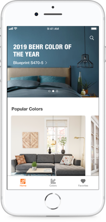
Frame · Home
Project Color home screen with the 2019 Behr color of the year and popular colors
Start with inspiration
The color of the year, popular colors and room ideas up front.
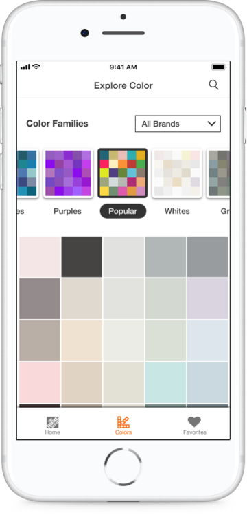
Frame · Color Wall
Explore Color screen with color families and a grid of swatches
Browse the whole wall
Every color in families sorted by hue, across brands.
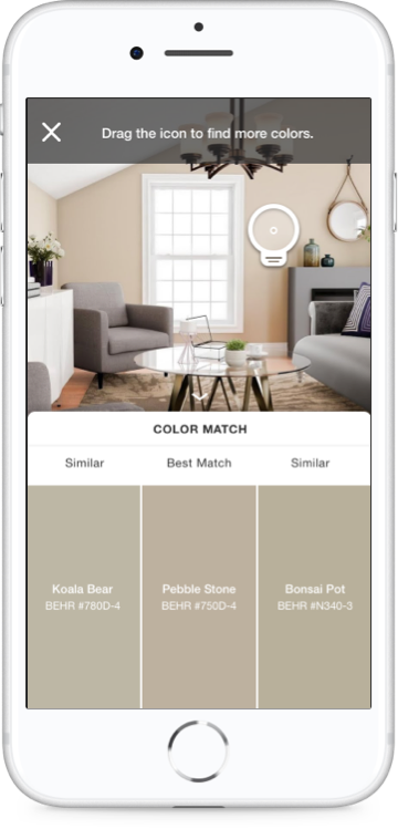
Frame · Color Match
Color Match on a living room photo showing a best match and two similar Behr colors
Match any photo
Drag the picker over a photo to get the best match and two similar colors.
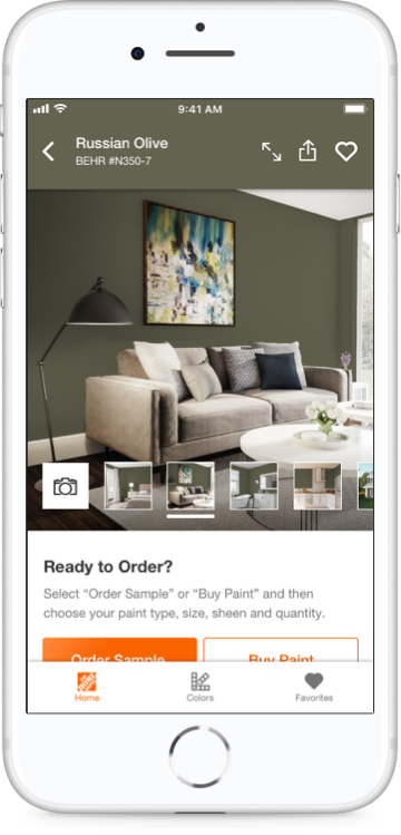
Frame · Room preview
Russian Olive shown on a living room wall with Order Sample and Buy Paint buttons
See it in a room, then order
Each color shown in room scenes, with Order Sample and Buy Paint right there.
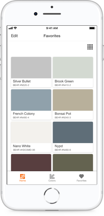
Frame · Favorites
Favorites screen with saved Behr paint colors
Keep a shortlist
Save colors to compare before you commit.
05

What it became

Project Color stayed a standalone app, and the research kept pointing the same way: help people decide, then hand them off cleanly to the core app and the store.

For customers
From 2.6 stars to 4.2 in the App Store

After the redesign, the App Store rating climbed from 2.6 to 4.2 as the app moved from choosing a chip to finding an idea.

For the business
Pinterest became the front door to paint

Pinterest boards and pins became a starting point for Home Depot paint, a partnership integrated media had shaped for more than a year.

For the team
Research that set the roadmap

Beta interviews and a diary study turned the top complaints into the next roadmap: better wall detection, truer color, and smoother handoffs to the core app and the store.

06

What I'd do differently

I'd bring it into the main app.

Project Color was funded by our paint merchants, so it lived as its own app, and when that funding ended, so did the work. As a feature inside The Home Depot app, it could have kept improving instead of fading away. The things that held us back, like wall detection and true-to-life color, only get better with time, and AI could push them further still.