For customers
The app that knows you’re in the store
It switches on in the parking lot at 2,000+ U.S. stores and gets you to the right aisle and bay, often before you hit enter.
A version of The Home Depot app built for one job: getting you to the right aisle and bay, one-handed, with the other hand on the cart.
At home, people browse, compare and buy. In the store, it's about one thing: finding it. Yet the app treated both the same way.
A typical Home Depot carries about 35,000 items, and no two stores are laid out exactly the same. People used the app very differently in the store, but every screen was still built for shopping from the couch. And most of The Home Depot’s sales still happen in its stores, so the store was where the app could matter most.
Store count from The Home Depot. 44+ counts people named in the launch announcement, not a dedicated team.
Store Mode is for wayfinding. Everything else had to earn its place.
You probably have one hand on the cart and your phone in the other, and you're walking. So everything got bigger and simpler: type, tap targets, fewer things on every key screen. And at launch, there was no way to buy from Store Mode at all.
The strategic call was to stop treating a store visit as one more shopping session. In the store, the app needed its own job, its own main action and its own way in. So Store Mode became a version of the app with a single measure of success: getting you to the shelf. That framing is what made every later decision, and every no, easier to make.
The moment Store Mode became the in-store experience, every team wanted their feature in it. Saying yes would have been easy, and it would have turned Store Mode into the core app with bigger buttons. I held the line that Store Mode is for wayfinding and gave every request the same test: if it wasn't about finding something, it didn't belong in Store Mode. I made that case to product partners, leaders and stakeholders, and they backed it. Protecting that focus is why it worked.
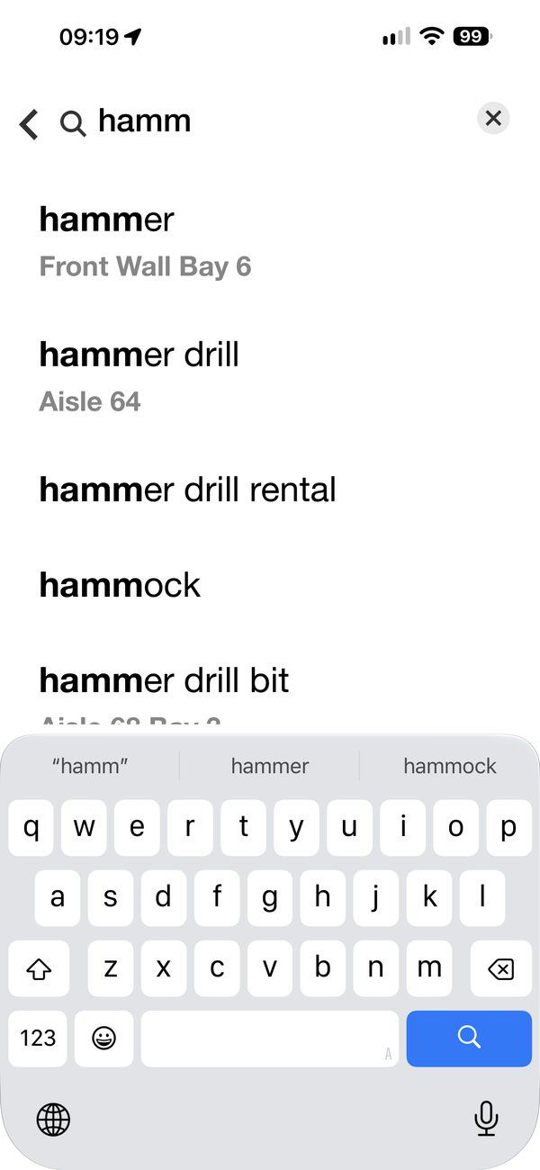
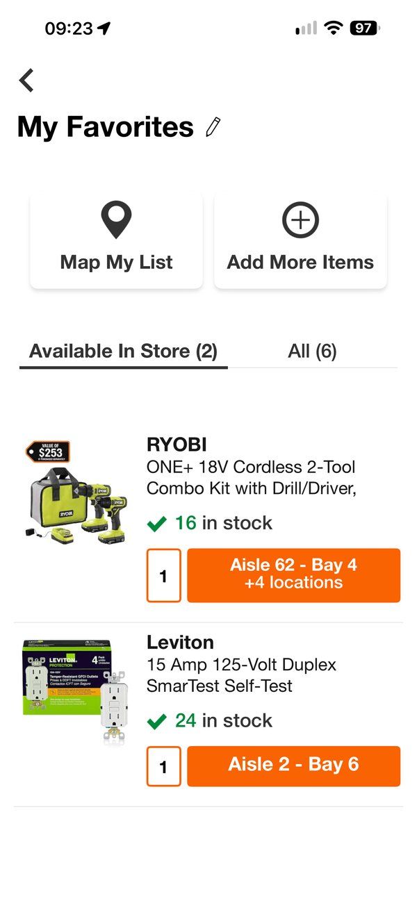
Almost every screen in the app was built to drive Add to Cart. In the store, that's the wrong job. I made the case that Store Mode should win by getting you to the shelf, so aisle and bay took the button's place. Search shows where things are before you hit enter, and Store Mode switches on by itself in the parking lot, so the right experience shows up without anyone having to ask for it.
Store Mode was never a design-only project. The launch credited more than 44 people by name across engineering, product, search and aisle-and-bay data, analytics, recommendations, research and content, PMO and site operations. Design’s job was to give that whole network one picture of the experience and one test for every decision, so a feature built by search or recommendations still felt like part of the same store companion.
I set the direction and led the early work with 3 to 4 designers. Once the vision was clear, the right move was to let go: I handed Store Mode to a designer on my team to lead and execute through launch, and coached them as they owned it. My recognition note called it “an amazing new feature and one that is sure to become a best in class experience.”
The single-largest advancement in our mobile app ever.
A huge unlock.
A HUGE milestone for the apps.
Other leaders called it one of the most significant UI changes the company had made, and a great customer experience that would unlock many opportunities.
The Home Depot app today, on the core we first shipped
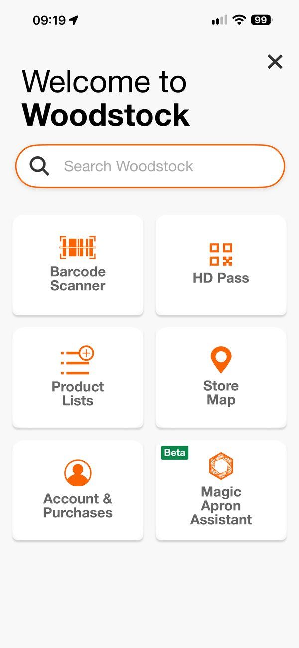
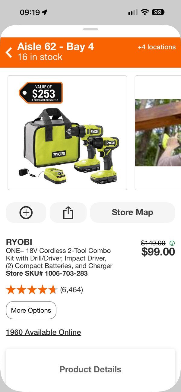
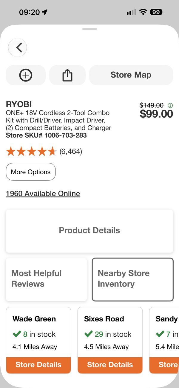
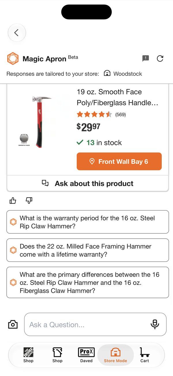
Store Mode became one of the biggest successes in the history of The Home Depot app. The real test of a foundation is how long it lasts.
It switches on in the parking lot at 2,000+ U.S. stores and gets you to the right aisle and bay, often before you hit enter.
The core we shipped is still the core today. Pro and project shopping research, and Magic Apron in every U.S. store, build on top of it, not instead of it. It also showed we could move the app’s design language forward in-house.
I set the direction, then handed it to a designer on my team to lead through launch, and coached them as they owned it.
I'd have done it sooner.
It was a hit right out of the gate, which tells me customers had been waiting for it. I'd also push the idea further: focused modes for other moments, like a job site mode for Pros or a DIY mode for someone in the middle of a project. Simpler versions of the app that change with where you are and what you're doing.